The boy ate an ice cream cone.
The freckle-faced, red-headed boy escaped the sweltering heat in the shade of a luscious, green Oak tree while enjoying a double scoop strawberry ice cream cone.
Which sentence do you prefer?
Some people prefer the "Just the facts, Ma'am!" approach. Others love the way the second sentence draws them in to the story being told. Just like adjectives and adverbs can spice up an otherwise ordinary sentence, I'm discovering that Photoshop actions can breathe new life into your images.
I know. I know. I've said before that actions were not for me. You might recall, though, that I did say I was going to make it my goal this year to at least take them for a spin and learn something new. Imagine my surprise when I pulled up the Pioneer Woman's blog the other day and found some free downloads - 2 sets of them. Perfect! Better yet, I could try them out without investing a dime.
What I found is that Photoshop Actions can actually be quite useful and equally fun. See for yourself. Below are a series of pictures. The first image in each set is my original "Straight Out of the Camera" (SOOC) image - with my standard very basic enhancements in Bridge. Above the second image in each series I'll tell you exactly which actions I used to create that particular affect.
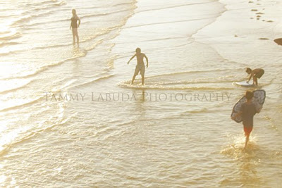
This first image was taken with our very first digital camera - a 1 megapixel Nikon Coolpix. I wasn't shooting manually or Raw at the time, and I hadn't even taken any classes or read a single photography book. Apparently composition was an innate gift as this image has a perfect diagonal composition. My professor even told me that it would make a great advertisement with plenty of room for text throughout the image.
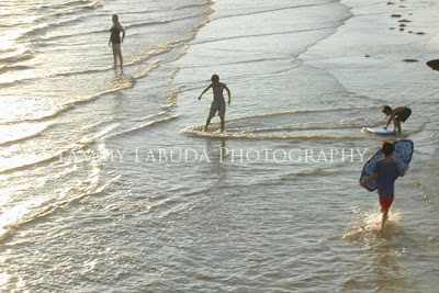
For this second image I opened it up in Photoshop CS3 and applied the BOOST action from Pioneer Woman's Actions Set 1. Then I flattened the image and applied SUNSHINE from her Action Set 2. I lowered the opacity on that second action slightly. I like both of these images equally well. It's fun to discover that you can get two completely different looks from just one image.
In my opinion this next image from the Fantastic Four's session was perfect as is, but I made a promise to myself to at least TRY all these actions. So, I did.
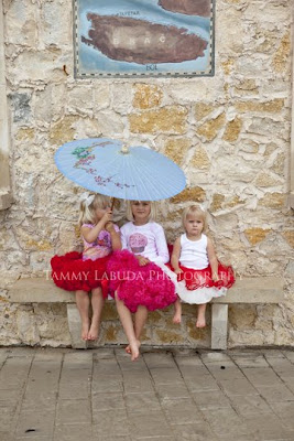 I applied VINTAGE from Pioneer Woman's Actions Set 1 and lowered the opacity until I was happy with the results. Doesn't the vintage action add to the old world charm of the location?
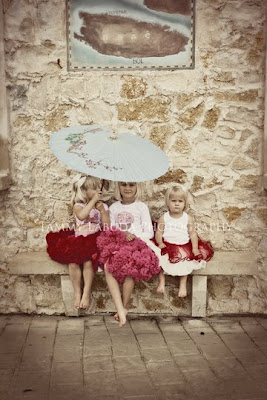 Here they are: The Fantastic Four! The only initial change I made to this image was to add some slight sharpening to the oldest girl's face. Since she was not on the same plane as the other three children, she wasn't in focus as well as the others. Otherwise, this image is SOOC.
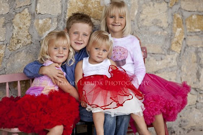 For a slightly different look I applied the SEVENTIES action from PW's Actions Set 2, flattened the layers, then added QUICK EDGE BURN from the Actions Set 1. I significantly lowered the opacity of that last layer to get the look I was after.
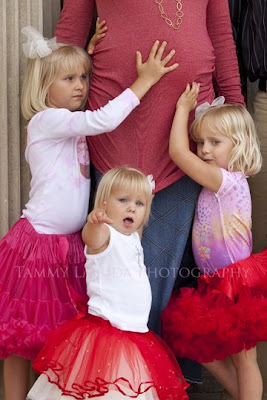 I wanted to show you this last action called PWs B&W from her Actions Set 1. Take a look at the youngest girl's face in this second image. Do you see how the flesh glows and the face is undefined. This is a VERY popular look right now in the children's photography world. Here I achieved this look by applying PW's B&W action, lowered the opacity A LOT, then clicked on the same action one additional time to achieve the "glow".
Though I had great fun checking these out, I'm not sure these are for me yet. We'll see. There are a few really useful actions that I do LOVE. Perhaps some of these more creative ones will grow on me. In the meantime, if you'd like to have some fun of your own, check out Pioneer Woman's blog. You'll love what you see. Here's the link to the Photoshop Action Downloads. You will need Photoshop (sorry Elements users).
Thank you! Thank You, Pioneer Woman. (Or, should I call you Wonder Woman?)


