Tuesday, September 30, 2008

Casting Call

I am currently hoping to expand my portfolio in a couple of categories.  If you are (or know of) a teenage or college age boy, an engaged couple, or a pregnant lady, I need you!  

If you live in the Allen or North Texas area and would be interested in allowing me to photograph you for my portfolio (website), please email me at labuda@sbcglobal.net.  Please include a current photo along with your name and phone number.

In exchange, you will receive a free session and a free 11x14.

Please pass this link along to those you think might be interested.

Thank you so much!

Friday, September 26, 2008

Telling a Story

Photographing children (and older ones as well) while they are busy at play is one of the best ways to capture authentic expressions - which makes for extremely endearing and dynamic images.

Like a short feature film, documentary style photography aims to record a specific stage of your child's development in the hopes of documenting memories that warm the heart for a lifetime.  I like to think of story telling images as my visual scrapbook. 

Younger clients especially enjoy this approach to photography as they don't feel under pressure to perform for the camera. While they are busy at play, they are hardly even aware that you are busy at work. Engrossed in their own thing, they forget about the camera, leaving the photogapher free to let their creative juices flow.

Take the following series of images below of this little girl reading in her nursery. What started out as an experiment in window light turned into one of my favorite story-telling sessions ever. I'll always treasure these images as they capture the curiosity of young ones perfectly.


Making sure to take a variety of shots helps to tell the complete story. In the first image I made sure to get the whole scene in the frame in order to set the stage for the story I wanted to tell.

Next, I cropped in closer to focus in on her hands paging through the pile of books scattered around her. Notice her curled up toes almost helping to hold up the book? This detail may have been lost with a wider crop. 

Zooming in on her tiny hands holding the Morning Prayer Book in the next image records her physical development and age. I will always have this record of her tiny toes and dainty fingers. The low f-stop insures the details stand out in significance.

Since the little girl was engrossed in her task at hand, I was free to zoom in for the extreme close up of her face in the next image. Capturing her long, dark lashes (without her even batting an eye) would have been next to impossible had I asked her to pose. 

I end the story with one last full frame image that sums up the experience in a nutshell. Pure joy! Recorded on digital file for all time is a record of this little girl's curiosity, joy, and exploration. Mission accomplished.  

Shouldn't our goal as photographer's be that all our clients have just as much fun during their sessions?  And how much fun will it be for their parents to see a series of images that capture their child so beautifully and perfectly.

Give it a try yourself. Below are some ideas for your own storytelling series:
  • Learning to ride a bike.
  • Writing with chalk or finger painting on the sidewalk.
  • Baking cookies with mom in the kitchen.
  • Playing in the sprinkler and throwing water balloons with cousins in the back yard.
  • Throwing a tea party for their friends and stuffed animals.
  • Playing dress up in daddy or mommy's clothes.
  • Playing legos on the kitchen table.
  • Talking on the phone with a best friend.
  • Shopping at the mall.
  • Skateboarding at an extreme park with friends.
You get the idea. Be creative. Start by setting the scene.  Pay attention to the little details that make your story unique.  And, finally, don't be afraid to crop in tight filling the frame with your subject's face.

Every one has a story tell. Now, go, tell yours.

Thursday, September 25, 2008

Photography Tip #5: Leading Lines

Like every good novel, a photograph should take its viewers on a journey.  It should grab their attention, guide them in the right direction, and provide a way out.  There should be energy, movement, emotion, and flow.  Leading lines are the tools photographers use to help narrate their stories.

Diagonal lines and s-curves are two types of leading lines used by photographers to draw attention to their subject and to breathe life into their images.  Take a look at the following examples.

In the image above, you'll notice that the pathway forms an s-curve starting at the bottom of the image curving all the way through to the backside of the image.  It is the tool used to draw you through the image.  Placing the family on the lower third not only gives the image more compositional strength, it also evokes movement.  The viewer is left with the impression that the family is on a walk.  You feel like joining them.  The path not only shows where the family will end up, but it also leads the viewer's eye out of the image - something every good image should do.

The image below utilizes the same compositional strategies of the rule of thirds and the leading lines.  Except this time diagonal lines were used in place of the s-curve.  Another difference?  Placing the subjects facing the camera removes the feeling of movement.  Time stands still.

Close-up images can also benefit from the use of leading lines.  In the image below I tilted the angle of the camera slightly to place the subject on a diagonal line.  Having her tilt her neck emphasizes these lines. Even the collar of her shirt forms a diagonal line that leads the viewer directly to her face.  It then leads the viewer out of the image by visually connecting with the diagonal line formed by her cheek.

Diagonal lines and s-curves can also be used to add visual impact and punch, as in the image below.  Another leading line shows up in this image as well.  The circle. The diagonal railing brings your eye to his folded arms which bring your eyes up and around his upper torso to his face and back down again to the railing which brings your eye out of the image.  The visual circle forces your eye to the subject's face - the goal of all portraits.

As you've just seen, diagonal lines can transform a photograph. Imagine the following image had a diagonal line not been used.  It would be flat and boring. The diagonal line adds energy, depth, interest, and movement to the image.  Your eye travels into the picture at the lower right corner through all pairs of legs and back out the left side of the image.  The result: Movement and Energy.

This last image is special in that it combines three tricks of the trade. Can you identify them all?  

1) The Rule of Thirds was used to position the father and son.  2) The tree provides a diagonal line leading to the subject and then out of the image.  3) The father's arms embracing his son form a visual circle leading to their faces.

Leading lines should not be ignored.  Use them to your advantage and your images WILL get noticed.

Monday, September 22, 2008

Ellie

Ellie is one of those little girls that loves to pose.  She made this photo session so much fun.  I rarely had to tell her what to do.  In fact, many times, she was the one giving me ideas.  The flower behind her ear...Ellie's idea.

I wanted to post some pictures from her session to show you two things.  1) Off center framing, and 2) The use of backgrounds to create emotion.

In these first two images you will notice that Ellie appears to be in the center of the image. Take another look and you will see that she is just slightly off-center.  This is another trick photographers use to get their images noticed.

The use of different backgrounds helps to create emotion in your images.  As in these images below, the gazebo setting evokes a tranquil, peaceful feeling.  In contrast, the urban alley backdrop brings energy, edginess, and spunk.  

When selecting locations, it is also very important to keep the colors of your backdrop in mind when assisting your client in making their wardrobe selections.  The outfit can make or break the shot - as can the backdrop.  So, plan ahead and be prepared to offer your clients a variety of suggestions in coordinating the two.  

Whether it be the urban alley or the tranquil gazebo, Ellie rocked this session!  Personally, I think she is one of the most adorable little girls ever!  

FYI:  Need help keeping your young clients happy?  The oversized sucker you see below brought out the brightest of smiles!  (Just be sure to check with Mom first.)  


Thursday, September 18, 2008

Photography Tip #4: The Rule of Thirds

I don't know about you, but every time I go to the theatre to see a movie I make a bee-line for the seats in the center of the theatre.  To me, the view is just better there.  I'm willing to bet many of you do the same thing.  Odd habit?  Apparently not.  There's actually scientific reasoning behind it.  Did you know that our brains automatically try to center everything we look at?  

This scientific fact explains why most people naturally center their subjects while taking a photograph.  While the brain may like things dead-center, placing your subject in the middle of your image is the fastest way to get your images ignored.  It practically ensures no one will take a second glance at your work.  It's too ordinary.  It's too expected.  It's too natural.  

Just like advertisers are constantly seeking new gimmicks to get their consumers to take notice of their product, photographers have to use a few tricks of their own to get people to stand up and take notice of their work.  First up in a photographer's bag of tricks is a little something we like to call The Rule of Thirds

The basic concept of the rule of thirds is to place your subject anywhere BUT the center of your photograph - more specifically on one of the thirds.  The diagram below illustrates this concept.  The goal is to mentally divided your image into thirds both vertically and horizontally. Your subject should be placed on one of the points where these lines intersect (indicated by the green dots).  By using this concept, you can take your images from ho-hum to WOW!  

How, you ask?  Since your subject is no longer in the center, your brain suddenly takes notice.  Alarm bells go off.  It takes a second look to see what's going on - and it likes what it sees. Goal accomplished!  Isn't that the reaction we're after?

In the image below, I purposefully placed the fence post and sign on one of the thirds.  This helps to add interest to an otherwise ordinary scene. I used another little trick as well (in addition to a large aperture) - a little something called leading lines.  But, I'll cover that trick of the trade next time.

Tuesday, September 16, 2008

Quiz Answers

If you haven't taken the quiz from the previous post yet, you may want to skip this post until you've come up with your own answers.  For those of you who were ambitious (or curious) enough to tackle the first quiz challenge, here are your answers:

1. b) f/2.8

This large opening allowed the light to splatter across the edges leaving a very small zone of focus.  As a result I was able to single out just one of the cake balls out of a platter of many.

2. a) f/22

A small aperture of f/22 insures that every detail from the brook in the foreground to the mountain caps in the background remains tack sharp. This is also referred to as a storytelling aperture - as it tells the beginning, the middle, and the ending of your image's story.

3. a) a slow shutter speed

Using a shutter speed of 0.3 seconds I was able to keep the camera's shutter open long enough to record an arc of light while the flashlight circled in front of the camera.  I used a tripod for this shot.

4. b) include the outline of the eye furthest from the camera in the image.

Doing this adds depth to your profile image and keeps the face from appearing flat and one-dimensional.

So, how did you do?  Are you ready to learn some more photography skills?  I hope so.  In case you haven't noticed, I have been posting a little more frequently than once a week.  So, check back often, and don't forget to share this blog address with your friends.

In my next post I plan to bring things down a notch or two.  I'll be discussing how to frame your images to gain maximum impact.  For now, thanks for checking in.  I'm having a wonderful time sharing my passion for photography with you.

Sunday, September 14, 2008

Quiz Time

So far I have covered some pretty in depth lessons on shutter speed and aperture.  To be sure you've got these concepts wrapped around your noggin, I've come up with a quiz of sorts to test your handle on these newly acquired skills.  So, get out your #2 lead pencil.  Quiz time begins now...

Question #1
Which of the following three aperture settings was used to make the following image?
a) f/16
b) f/2.8
c) f/8

Question #2
You're out hiking at Yosemite National Park when you come across a beautiful brook at your feet.  Thinking it doesn't get any better than this, you raise your eyes toward heaven to breathe a sigh of thanks when you catch glimpse of the breathtaking mountain caps in front of you.  Not wanting to lose this memory, you grab your camera to take a couple shots.  

Only there's a major problem: You only have one exposure left.  You've got no choice but to compose your shot so that BOTH the bubbling brook and the far off mountain caps appear tack sharp in your image. You don't want to lose the tiniest of details.  You want to remember it all.  Which aperture do you choose?

a) f/22
b) f/1.4
c) f/5.6

Question #3
The following images were made using:

a) a slow shutter speed
b) a fast shutter speed


Question #4
To make a great profile image, it is important to remember to:

a) focus in on the eye furthest away from the camera.
b) include the outline of the eye furthest from the camera in the image.
c) include only one of your subject's eyes in the image.

Answers: Check out the next post for the answers to today's quiz.

Thursday, September 11, 2008

Ask Me Your Questions

Do you have a photography question?  I'd love to answer them.  Leave your question in the comment section, and I will do my best to cover them at some point in one of my weekly photography tip blog entries.

Tuesday, September 2, 2008

Photography Tip #3: Aperture

The aperture is an adjustable opening found inside the lens used to regulate the amount of light passing through the lens and onto the film (or digital media).  Apertures are measured as f-stops.  A large f-stop (f/11, f/16, f/22, etc.) indicates a small aperture.  Small f-stops (f/1.4, f/2.8, f/5.6, etc.) indicate a large aperture.

While aperture can be used to manipulate the amount of light you allow into your camera, it is better known for its ability to manipulate depth of field (the area of sharpness from near to far within a photograph).  

If you want everything in your picture to be tack sharp (from the flowers lining the fence in the foreground to the chimney on the farmhouse in the distance), then you need to select a smaller aperture (anywhere between f/16 - f/22 or greater).  

In contrast, if you only want a small amount of your image to be in focus (you want to focus in on just one red rose from your grandma's entire rose garden), then you will want to use a larger aperture (anywhere between f/1.4 - f/5.6).  The smaller f-stop will blur the background while keeping your subject in focus.  This helps to isolate your subject and bring more attention to it (as in this image below):

In his book Understanding Exposure, Brian Peterson explains aperture like this: 

"Imagine using a funnel with a very small opening and pouring a one-gallon can of paint through it into an empty bucket.  Compare this process to pouring a one-gallon can of paint into the same empty bucket without the aid of a funnel.  Without the funnel, the paint gets into the bucket quicker, but it also splatters up on the bucket sides, as well.  With a funnel, the transfer of paint into the bucket is cleaner and more contained.  Keeping this is mind, you can see that when light is allowed to pass through small openings in a lens, a larger area of sharpness and detail always results."

In the image above, I used a very large aperture - which in essence allowed the light to splatter along the sides of the paint bucket.  So, only the area focused on (the red flower) is sharp.  The out-of-focus blurry background is the remainder of light that was allowed to splatter up along the sides of the bucket.  Had I taken this image with a very small aperture (f/22), then every leaf in the background would have been tack sharp.

So what aperture do you choose?  It all depends on the end result you desire.  If you want to see every tiny detail from front to back, choose a very small aperture (large f-stop).  Get out your funnel.  If you want to limit the area of focus to a single area within a larger composition, you will want to purposefully blur most of the other details in your image by choosing a very large aperture (a very small f-stop).  Pour the light in and let it splatter!

I don't know about you, but I'm a visual learner and have always learned best by seeing concepts in person.  So, to illustrate what happens when you adjust your aperture, I've included the following three images:


In the first image, you'll notice that very few of the rows of beads are in focus.  At f/1.4 (a very large aperture) most of the light was allowed to splatter away from the central area of sharpness creating an image that is mostly out-of-focus.

In the second image I used a medium aperture of f/5.6 to create a somewhat sharper image.  But, because it is still a lower f-stop, you still see some fall-off on the outer edges of the image.  You could say I used a funnel here - just a very large one.

The last image was taken at f/22.  You'll notice that every bead is tack sharp.  With this tiny aperture (large f-stop), all of the light was contained leaving nothing to splatter onto the edges.  As a result every bead is tack sharp.  If you look closely, you will even notice that the bookshelves behind the bead board also came into greater focus at this aperture.

If you are really paying attention, you will also notice that all three images appear equally bright.  To achieve the same exposure for each image I had to remember to adjust the shutter speed or the ISO settings each time I made an adjustment to my aperture.  Had I not done that, the image would get darker each time I switched to a smaller aperture.  

Confused?  Think about it this way.  If the aperture is the size of the hole inside your lens where light enters the camera, doesn't it make sense that less light would be entering the camera if the size of that hole is shrinking?  So, how do you get more light into the camera?  Simply make sure that hole stays open longer.  And that in a nut-shell is why I must change the shutter speed to ensure a proper exposure.  

Last time we learned about shutter speed (timing).  Can you see now how it is all coming together? This photography stuff isn't as daunting as you thought, now, is it?

There's just one last thing to discuss when it comes to aperture and depth of field.  When using a large aperture (a small f-stop), it is important to remember to keep your subjects on the same plane when taking group pictures.  If one person is further in front of another, one will be in focus and the other one will be out of focus (one will be right under the funnel and the other will be splattered up against the side of the bucket).  Similarly, if one is taller than the other (and I've focused in on the taller of the two), the shorter one may not be in focus because he is on a different plane.  

In cases like this you may want to go with a smaller aperture (a larger f-stop) to insure that everyone of importance remains in focus.  When taking group pictures, another good tip is to tell your subjects to imagine their noses are all touching the same pane of glass.  This will help to keep them all on the same plane - and in focus.  Sitting them at a table or on a couch also helps to keep them in the same plane of focus.

The following two pictures illustrate this well:
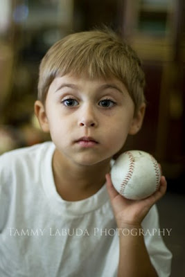
In this first image, the boy and the ball are almost on the same plane, so both are pretty much equally in focus.  If you look closely, though, you will notice that the ball is not quite as sharp as the boy.  This is because the ball is on a slightly lower plane than the boy's face (which was the focus point for this image).  

Keep in mind that this is the nature of a large aperture.  It lends itself to a very shallow depth of field.  When using a small f-stop it is not uncommon to have one eye in focus and the other blurry.  To make the portrait appear sharp, remember to focus in on the eye closest to the camera.  It also helps to shoot straight into your subject's eyes (not looking down on or up to) and to step back a little.  The closer you are to your subject, the less of the image will be in focus.
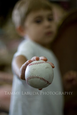
In the last image, the ball is in front of the boy, and the boy is set further back.  The boy falls out of the plane of focus and is blurred as a result. Using a low f-stop is the trick to isolating the ball from the boy - which can be a really cool affect.  It's how you can make a lone flower stand out amidst a whole bed of roses.  It's how you can focus in on just one child's face in a crowd of many other children.  It's how you can avoid a distracting background from overwhelming your subject.  In short, it's a photographer's best friend. 

Having a good understanding of aperture and shutter speed separates the beginners from the pros.  It takes a lot of practice, though, so grab your cameras, and get out there!  The fun is just beginning.

Photography Tip #2: Understanding Shutter Speed

I'm about to embark on a basic lesson for manual shooters (for those of you wanting to learn how to use the manual settings on your camera).

First up is a lesson on shutter speed.  The shutter speed is the length of time the light coming through the lens opening (or aperture) of your camera is allowed to stay on the film (or sensor) of your camera during any given exposure.  These speeds are expressed in seconds or fractions of a second.  i.e. 2, 1, 1/2, 1/4, 1/8, 1/15, 1/30, 1/60, 1/125, 1/250, 1/500, 1/1000, 1/2000, etc.

These numbers are read as two seconds, one 15th of a second, one 60th of a second, one 1000th of a second, etc.  The smaller the bottom number is in a fraction, the slower the shutter speed will be.  And vice versa, the larger the bottom number, the faster the shutter speed will be.

What it boils down to is this: A faster shutter speed can freeze the motion of a fast moving subject, and a slower shutter speed can blur that moving subject to give the impression of motion.

How is this useful to the average mom or hobbiest?  Let's say your daughter is swinging on the swings at your local park, and you want to get a clean shot of the joy spreading across her face (while she is moving).  Simply select a high shutter speed (at least 1/250 sec. or faster) to freeze the action and be sure to focus in on her face.  

In contrast, to capture the motion of your daughter swinging (think a nice blurry arch), choose a lower shutter speed.  Just keep in mind if you choose to use a shutter speed lower than 1/60 sec, you may want to mount your camera on a tripod to make sure the other elements in the picture remain sharp.  

The following series of pictures illustrate how adjusting your shutter speed can make a dramatic affect over the feeling of an image.  

In this first image, I started with a slow shutter speed of 1/6 of a second.  You will see that the fan blades are blurred.  It gives the impression that the fan is moving, but you can barely see the fan blades themselves.

I then switched my shutter speed to a slightly faster speed of 1/50 of a second.  You still see the blur of the fans in motion, but you can now begin to see the actual fan blades themselves.  The faster shutter speed is starting to freeze the action. 

In this last image I set the shutter speed to 1/800 of a second - a very fast shutter speed.  This stops the blades in their track and gives the impression that the fan is not even moving at all.  

This is the power of shutter speed.  Now you know how those professional sports photographers can get tack sharp images of a race car driving around a race track at over 100 miles per hour.  Put this knowledge to the test and imagine the implications this will have for your son's soccer games.  You can even get a great portrait of your child - without having to ask them to get off the swingset.  They can have their fun while you have yours! 

There's just one last (but very important) point to cover.  You might have noticed that along with the changing shutter speeds in these three pictures, the aperture (or f-stop number) was also changed.  That was necessary to make sure the exposure of each image stayed the same. Had I not changed the aperture the picture would have gotten darker and darker as I increased the shutter speed.  

Does all this talk about aperture have your head spinning?  No worries, I'll take on that beast next time.  For now, just have fun with your brand spanking new knowledge of shutter speed.  Go, grab the kids, head out to the park and freeze some of your own swing action!  Enjoy!